
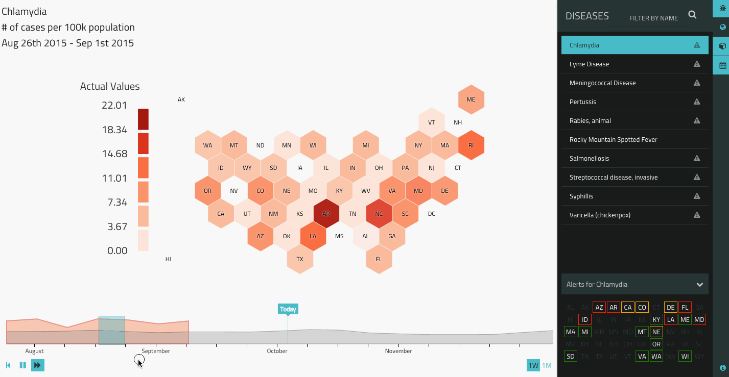
The visualization begins with actual data, highlighting outbreaks in shades of grey, and then transitions to forecast data in shades of red. This interactive application allows users to easily explore different diseases and identify georegions that are facing public health challenges.
The data is regularly updated in an automated process that takes several hours to complete, and includes harvesting and cleaning data from proprietary and government APIs, generating summary statistics, and finally compressing and packaging in a form suitable for viewing over the web. We built this application using D3 on the front end and R and MongoDB on the back end.